Kohbee users are primarily content creators with services to offer, courses to sell, workshops to run. No time or knowledge to build a website from scratch. They needed a way to go from idea to published landing page in minutes.
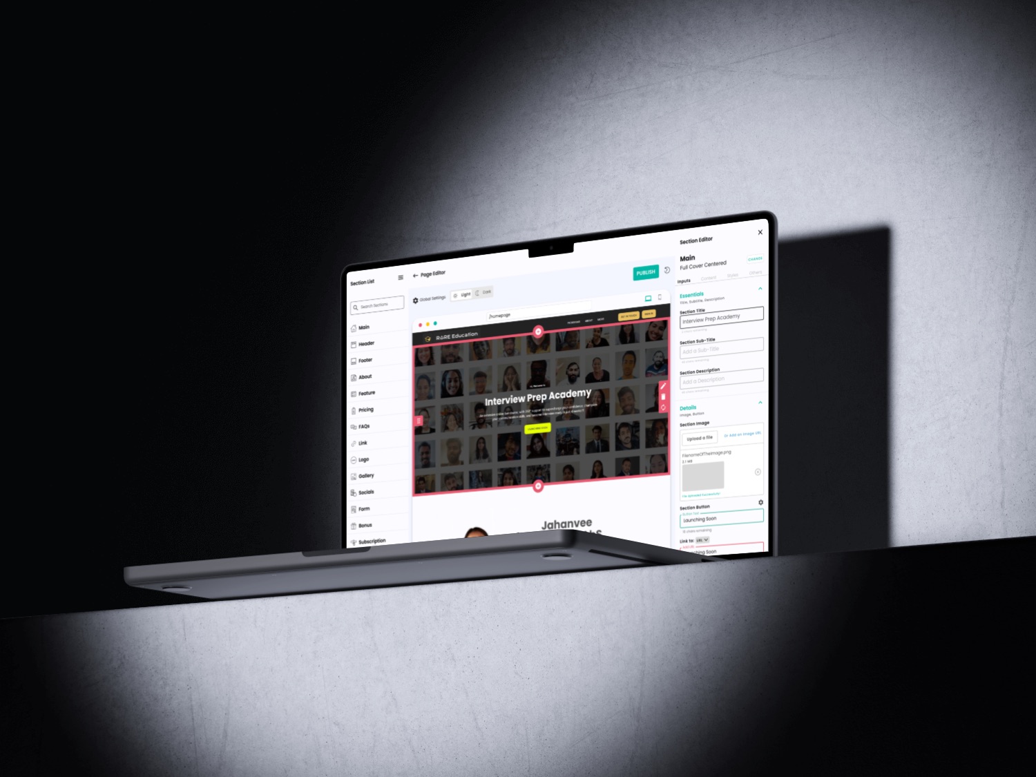
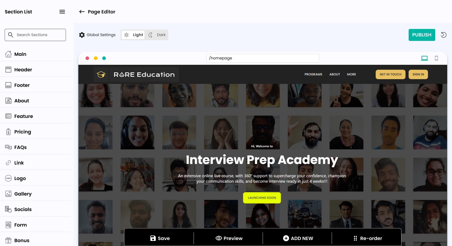
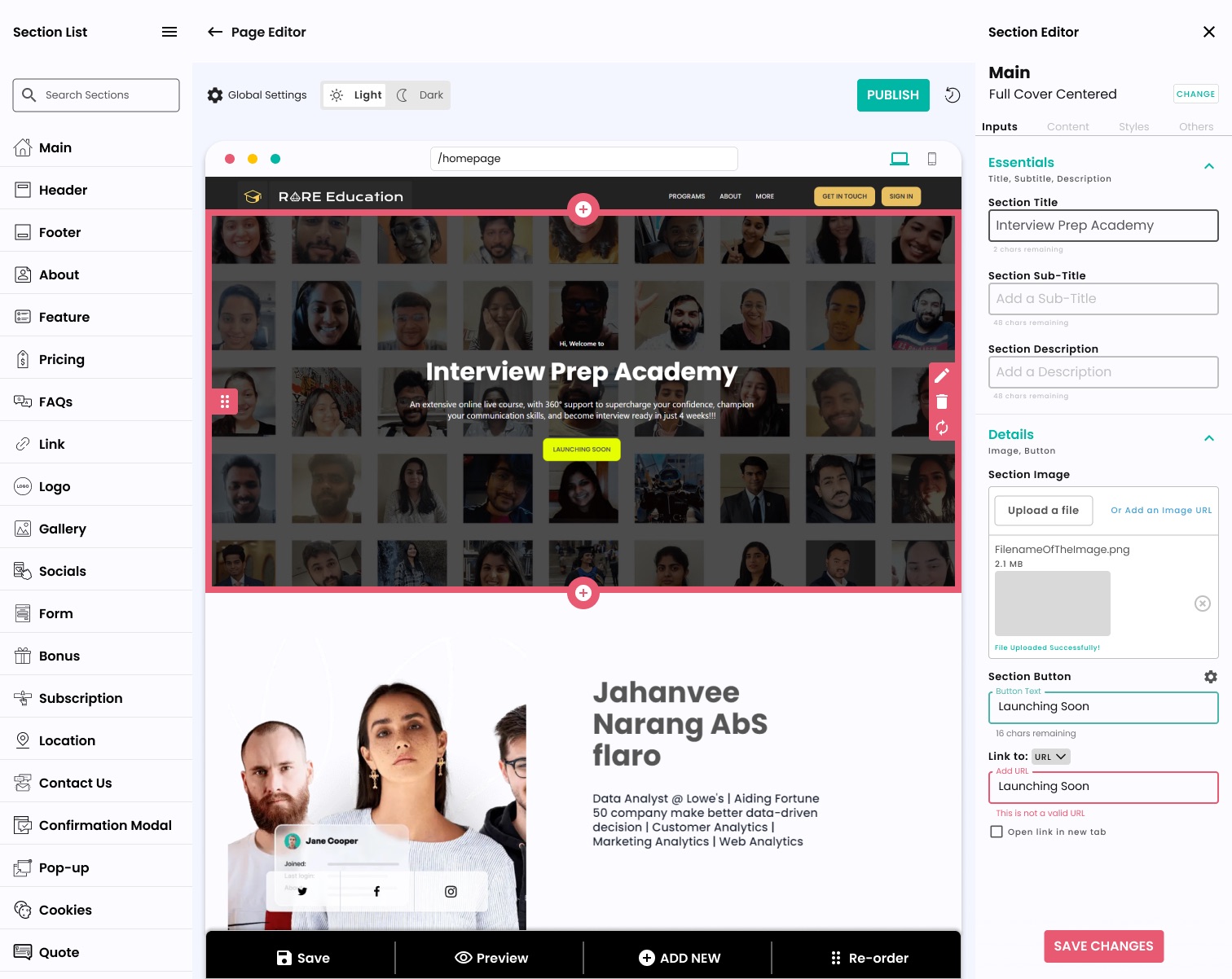
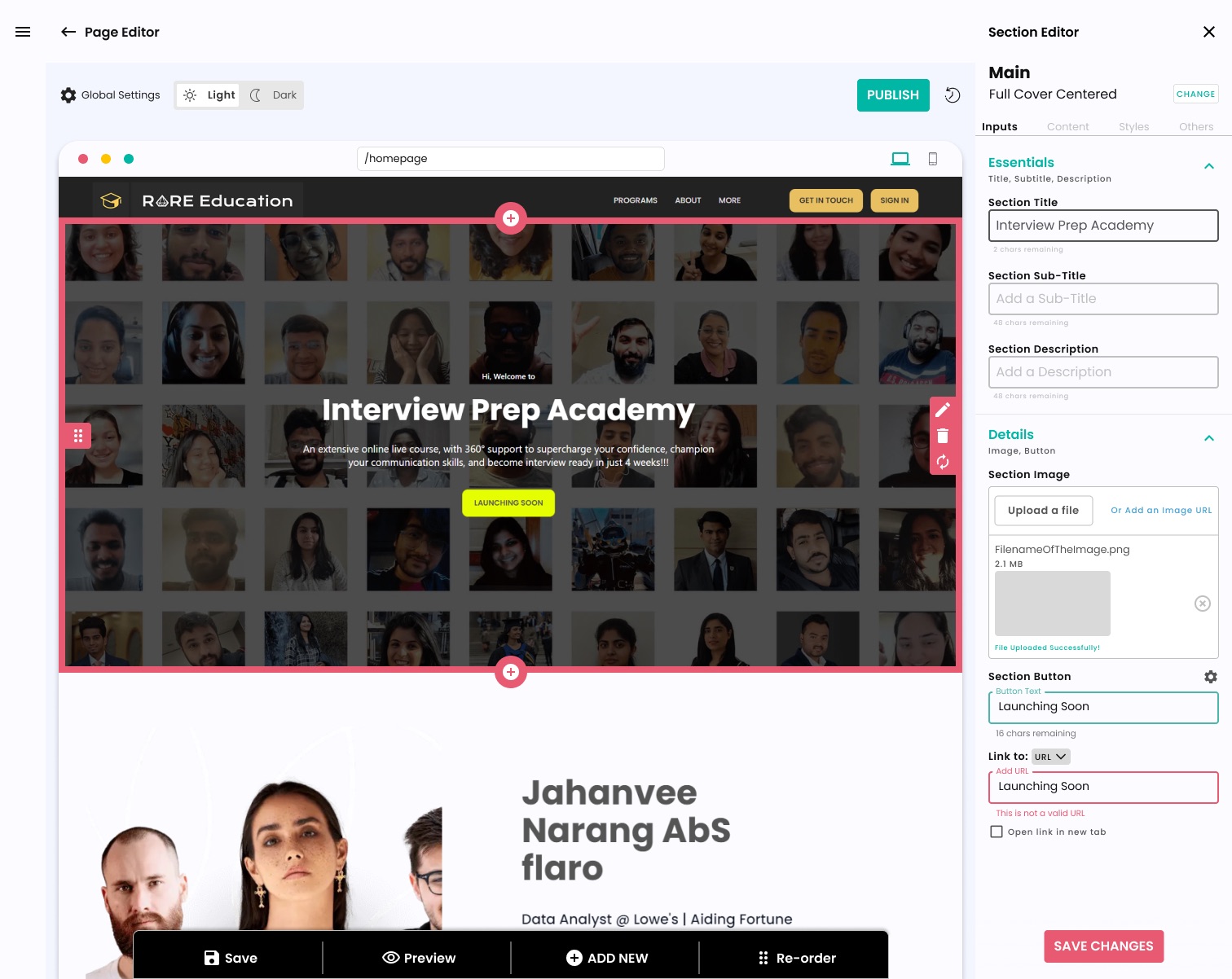
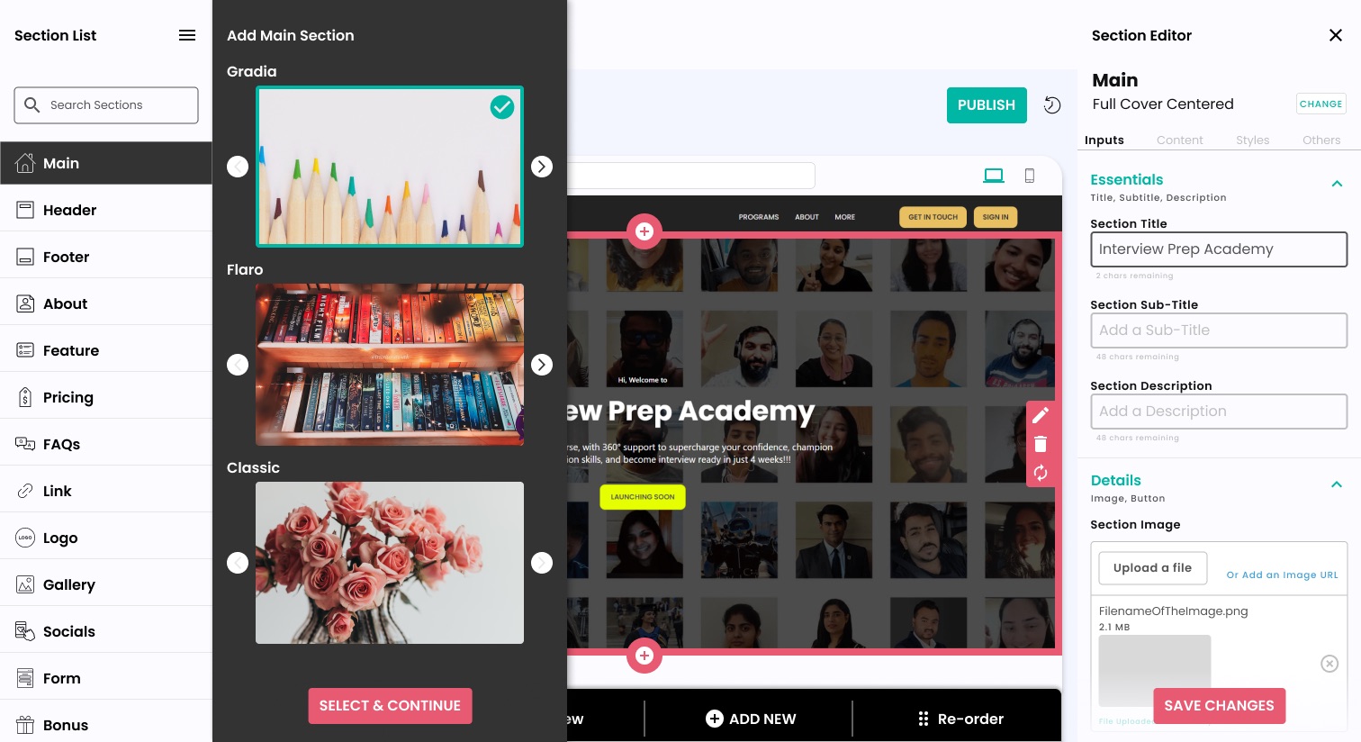
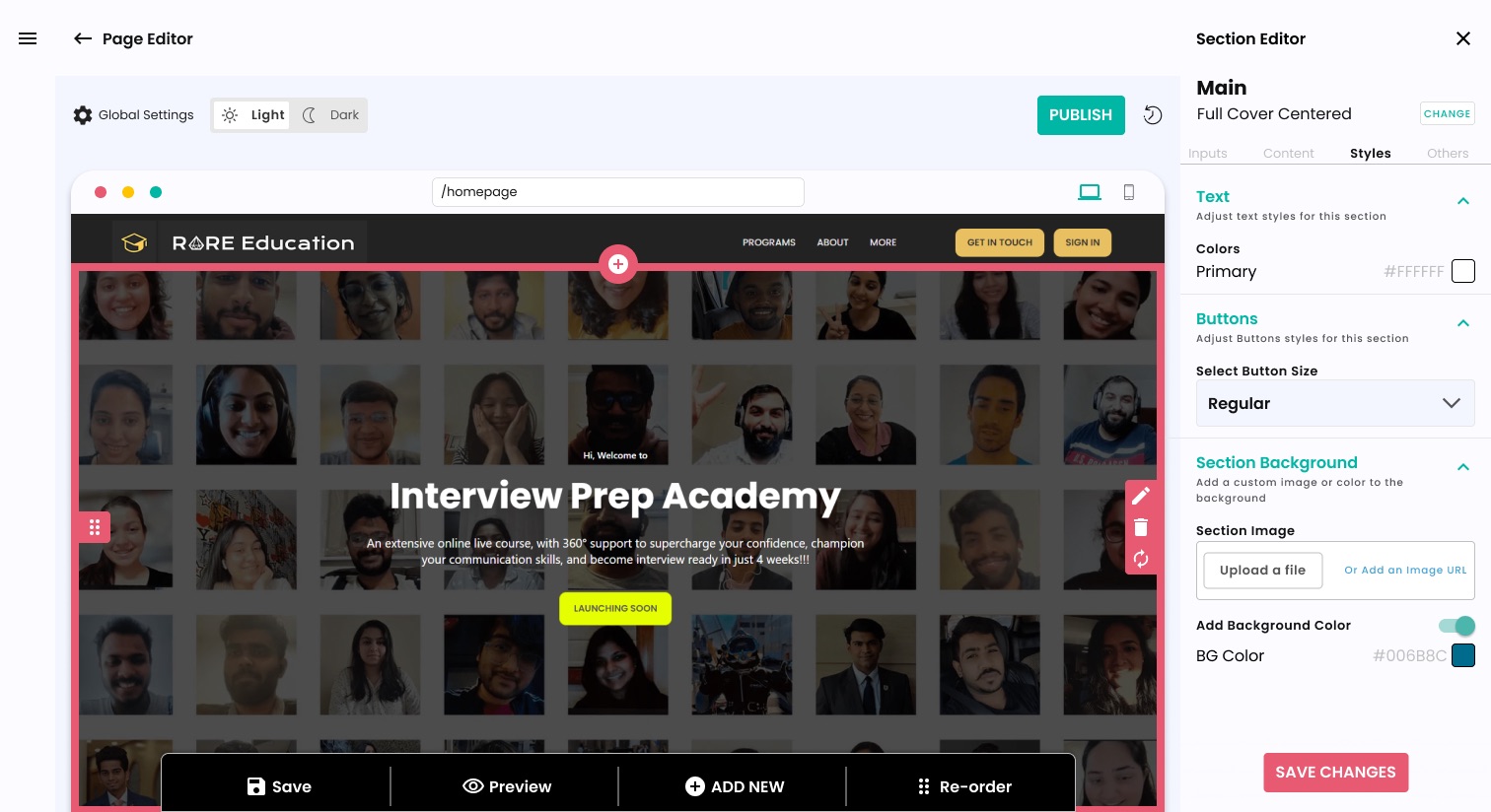
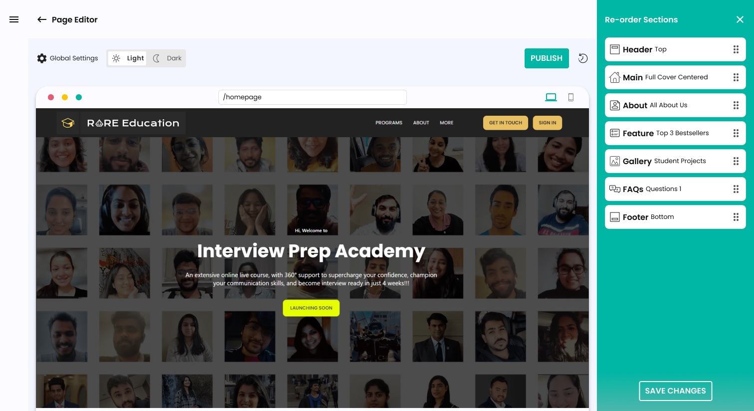
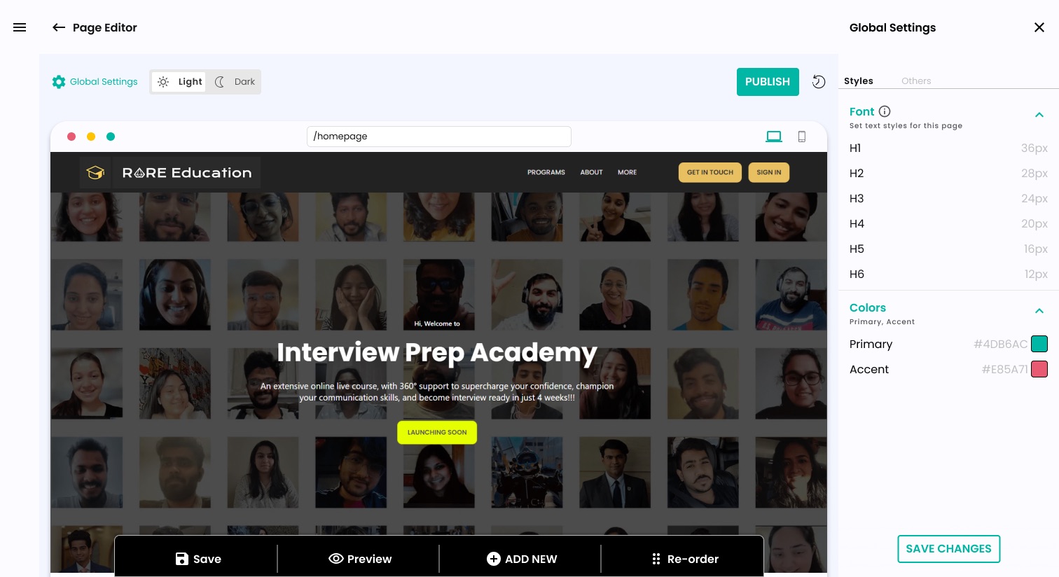
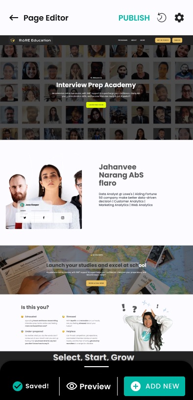
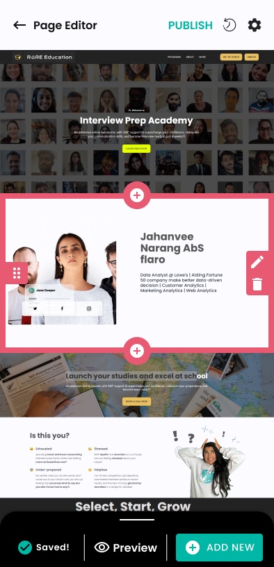
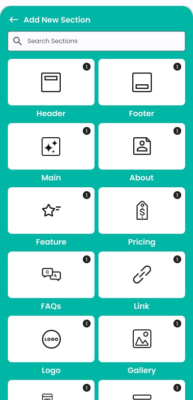
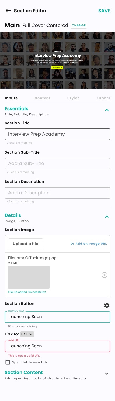
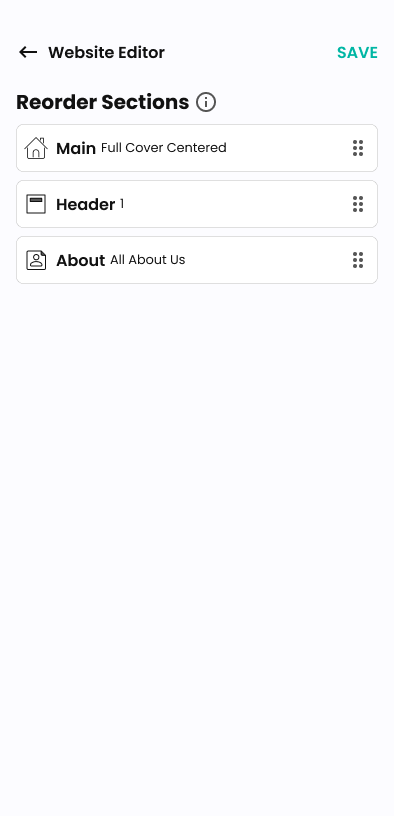
The result was a fully embedded builder within the Kohbee app, built around a three-panel layout: section list on the left, live dynamic preview in the middle, and a settings and editor panel on the right. Both side panels are collapsible on desktop for a distraction-free, full-screen preview.
The challenge was keeping it simple enough that a user with no design or web knowledge could produce something that looked polished and professional.
Like the User Management System, this was designed to be responsive from the start. On mobile, the left and right panels become their own dedicated screens.
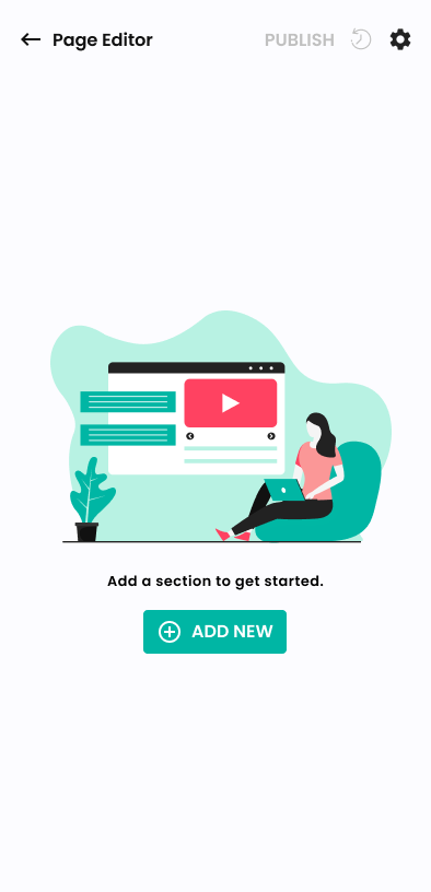
Non-technical users could build and publish a professional-looking page without any design or coding knowledge.
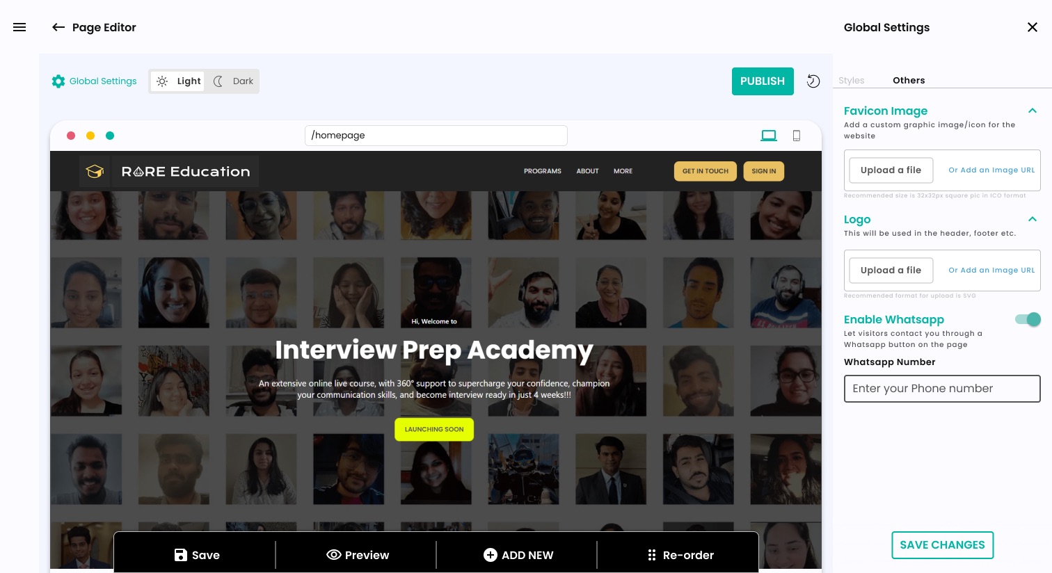
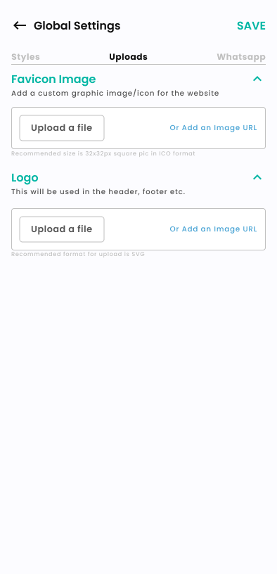
Per-section themes plus global styles gave users brand control across the whole page without managing every detail individually.
Fully responsive: left and right panels become dedicated screens on mobile with the same functionality.
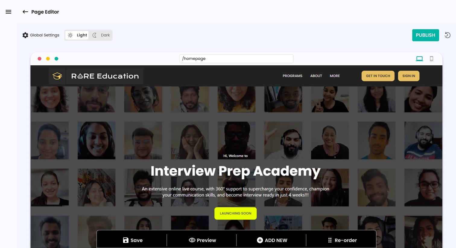
What you see is what you get: the live preview meant no surprises between editing and publishing.
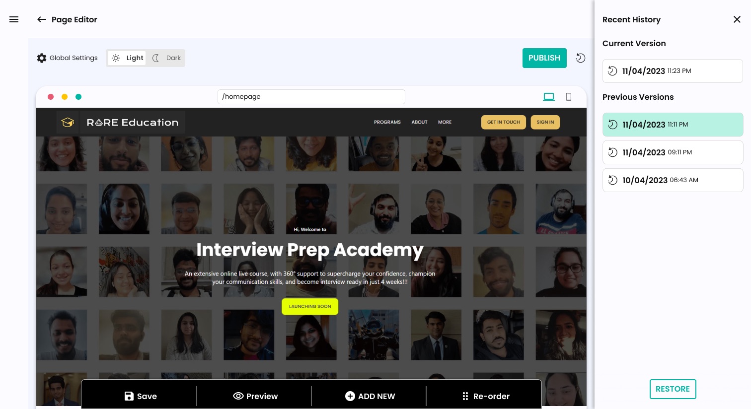
Every version saved client-side: users could experiment and roll back freely.